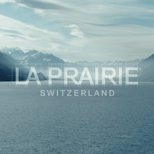
To start the year, La Prairie have announced the debut of their new visual identity. This is expressed through three re-imagined elements – a new logo, a new seal and a new font. As the world and La Prairie House continue to evolve, they felt it was the right time to reimagine their brand elements. The evolution is a way to celebrate their past, whilst continuously looking ahead to the future – embracing the core values and Swiss heritage of the Luxury House.
“Our logo is the reflection of La Prairie’s soul. It embraces the values and the heritage of the House; it expresses its singular identity to the world. It represents who we are, and who we will be tomorrow. Naturally, as the world and our House evolve, we felt it was the right time to re-imagine our logo. Untouched for almost fifty years, this new logo represents a key milestone in the story of our brand. It is a way for us to celebrate our past, while continuously looking at our future ahead,” said Greg Prodromides, Chief Marketing Officer of La Prairie.
La Prairie’s new logo is inspired by the elegant, capitalised Art Deco signage so ubiquitous to the 1930s architectural landscape of Montreux. It is a typographic style at once steeped in heritage and thoroughly timeless, bearing witness to an avant-garde period of artistic effervescence that coincides with the very beginning of the La Prairie story.
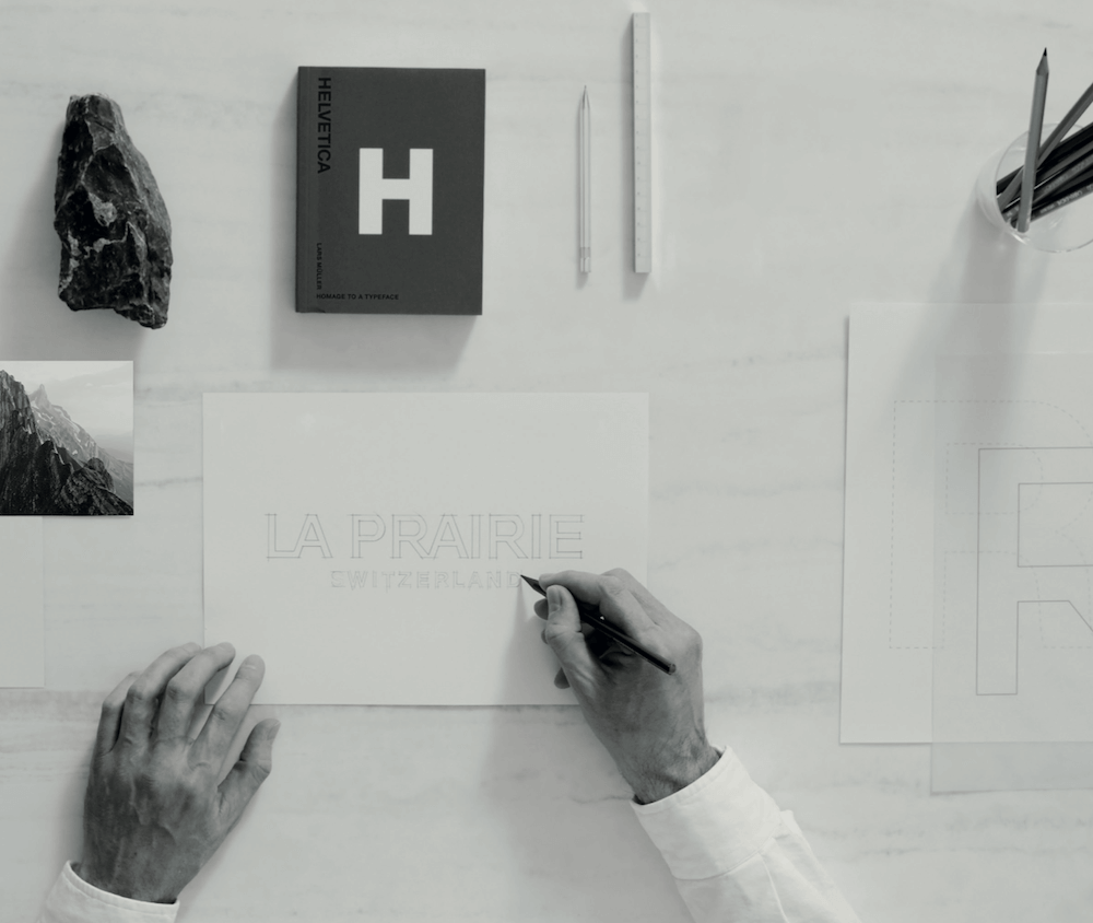
In the 1970s, the La Prairie logo was designed using a typography called Helvetica. Today, Helvetica is known as Helvetica Neue, and it is more than simply a font. Created in 1960 in ZOrich by typeface designer Max Miedinger, the font is a symbol of cutting-edge Swiss design, a masterpiece to which museums dedicate exhibitions all around the world.
La Prairie has chosen to celebrate its Swiss heritage taking inspiration from Helvetica Neue and evolving it with a contemporary reimagination. The letters of our original logo have shifted from lower case to all capitals, giving it more status and desirability. The design is sharper, more architectural, easier to read. It is aligned with the world in which we live.
The re-imagined logo is accompanied by a new signature seal. They will both be unveiled across La Prairie products and points of sale in the coming months.